




























Microsoft 365 Copilot is getting a cleaner, more buttoned-up redesign. Microsoft wants its AI assistant to feel less like a colorful add-on. Inside work apps, the pitch is now calmer and more serious.
In a Microsoft 365 Blog post, Chief Design Officer Jon Friedman says Microsoft redesigned the Copilot app. The company also changed how Copilot appears across Microsoft 365 apps. Its stated goal is a faster and more adaptive experience.
A calmer Copilot for work
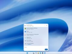
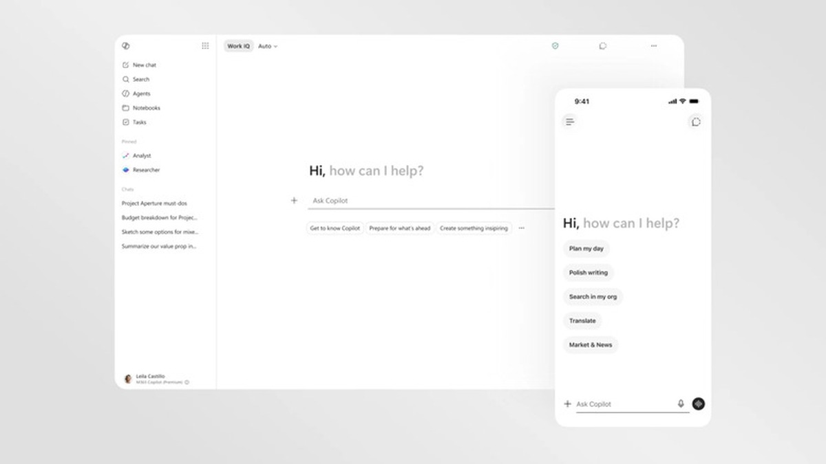
The biggest visual change is restraint. Microsoft is moving the productivity version of Copilot toward a largely black-and-white interface. It is more text-forward, with fewer playful surfaces competing for attention.
The new design still uses app icons and richer visuals where they help. By default, though, Copilot now looks more focused on reading, writing, and acting inside documents.
The new interface is easiest to understand in motion. Designer Andreas Storm’s X post shows the redesign’s quieter surfaces, expanding prompt box, and more app-like rhythm in a short video.
Microsoft has introduced a new design for Copilot pic.twitter.com/Bxdg6dKbfZ
— Andreas Storm (@avstorm) May 28, 2026
That matters because Copilot has to live across Word, Excel, PowerPoint, Outlook, and the standalone Microsoft 365 Copilot app. Microsoft says the update creates a more consistent entry point. From there, Copilot opens into a side pane that works with the document, spreadsheet, email, or slide underneath it.
The prompt box is becoming a workspace
The redesigned prompt surface is more flexible too. It can expand when a task needs more room. It can also keep pasted structure intact and reveal relevant controls as the user types.
Microsoft describes this as progressive disclosure: start simple, then show more tools when the work calls for them. That idea also fits the company’s wider AI design direction. Copilot should reveal extra structure, suggested prompts, or follow-up actions only when they help the task.
The company is also tying the experience to Work IQ. That Microsoft 365 intelligence layer can draw on emails, files, chats, meetings, and other work context when users allow it.
Microsoft says the Copilot app now loads more than twice as fast. Load times were reduced by over 50 percent in testing. The company also says response times for complex chat prompts improved by 10 percent.
Why this redesign matters
This is not just a skin change. Microsoft has been under pressure to make Copilot feel useful without crowding every corner of Windows and Office.
A calmer, more predictable design may help the assistant feel less intrusive. That is especially important for people who spend most of their day inside Microsoft 365.
The open question is whether the cleaner work-focused Copilot eventually influences Microsoft’s consumer AI experiences. For now, the redesign is aimed at productivity software, where consistency and trust matter more than personality. Tech My Money has also been tracking Microsoft’s AI push on the browser side, including Microsoft Edge Mobile’s Copilot upgrade.