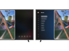
Many of you that decided to go over to YouTube today, might have recognized the fresh new look for the Google owned video sharing site that came out yesterday. It feels like a mini makeover for 2014 and I have to say it really needed a facelift before the summer (America).
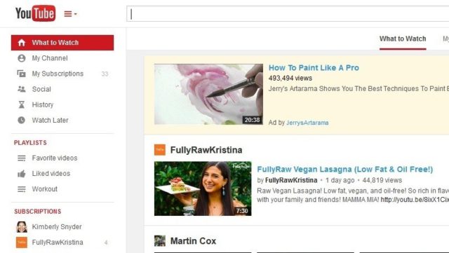
The new layout is still user-friendly. It allows more user control as far as what you are most interested in. On of the new features happens as soon as you log in, the ‘What To Watch’ page brings you the latest, recommended & popular videos from your personal subscribed channels as well as new channels that you might be interested in.
Also the sidebar menu gets a refresh, it can now be filled with your playlists, subscriptions and much more. By simply selecting the “guide” button next to the YouTube icon at the top left corner of the screen. The guide now has playlists that you created, along with playlists from your favorite other channels.
Here is a quote that came out Thursday from YouTube Web Developer Yining Zhao describing the reason for the new update:
“The way you watch YouTube keeps changing, so we’re making a few tweaks to YouTube to keep up with you,” The changes are intended to “make it easier to find what you want to watch on YouTube and collect playlists to watch again and again.”
When you make a playlist, you’ll see a new page that should make editing easier, Zhao said. It should also be easier to discover playlists on channel pages. When you visit a channel page, there will now be a link at the top for playlists.
The design changes come after Google earlier this month named long-time employee Susan Wojcicki YouTube’s new boss (Via PC Mag).
So go and check it out if you haven’t already the ‘new’ YouTube.
Sources: PC Mag & Angela Moscaritolo (of PC Mag)


