Android Lollipop is Google’s tramp stamp of identity. With Lollipop Google decided to overhaul the user interface of its Android system bringing brighter colors and lively animations. It stands out bold more than any previous Android version before it. When I first became an Android user I had been with an iPhone user passing through a Windows Phone phase. It was Android 4.0.3 and was Google’s Android greatest face lift ever. It had performance issues but showed Google had worked on better designs. With Lollipop they killed it in my opinion. It doesn’t only look better than anything else in terms of user interface design but looks different and recognizable. It has an image and an identity so every time you see a device you may know that it runs Google’s Android Lollipop.
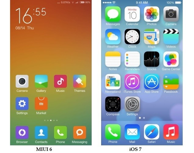
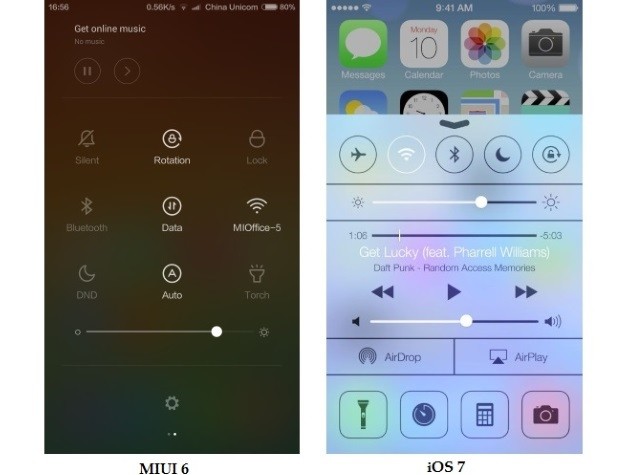
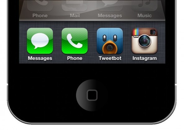
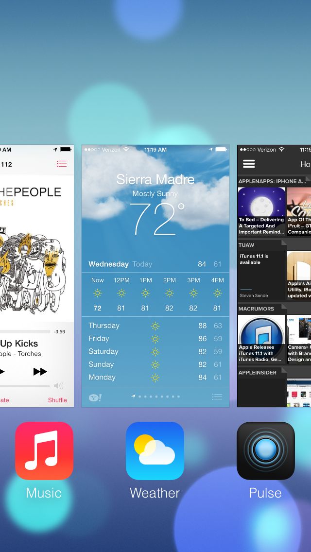
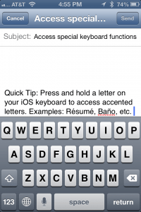
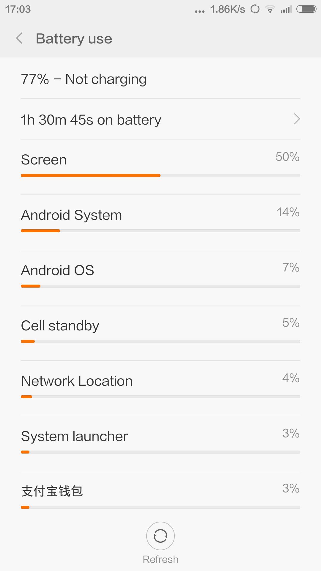
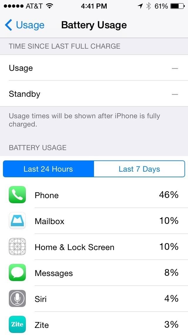
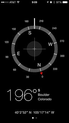
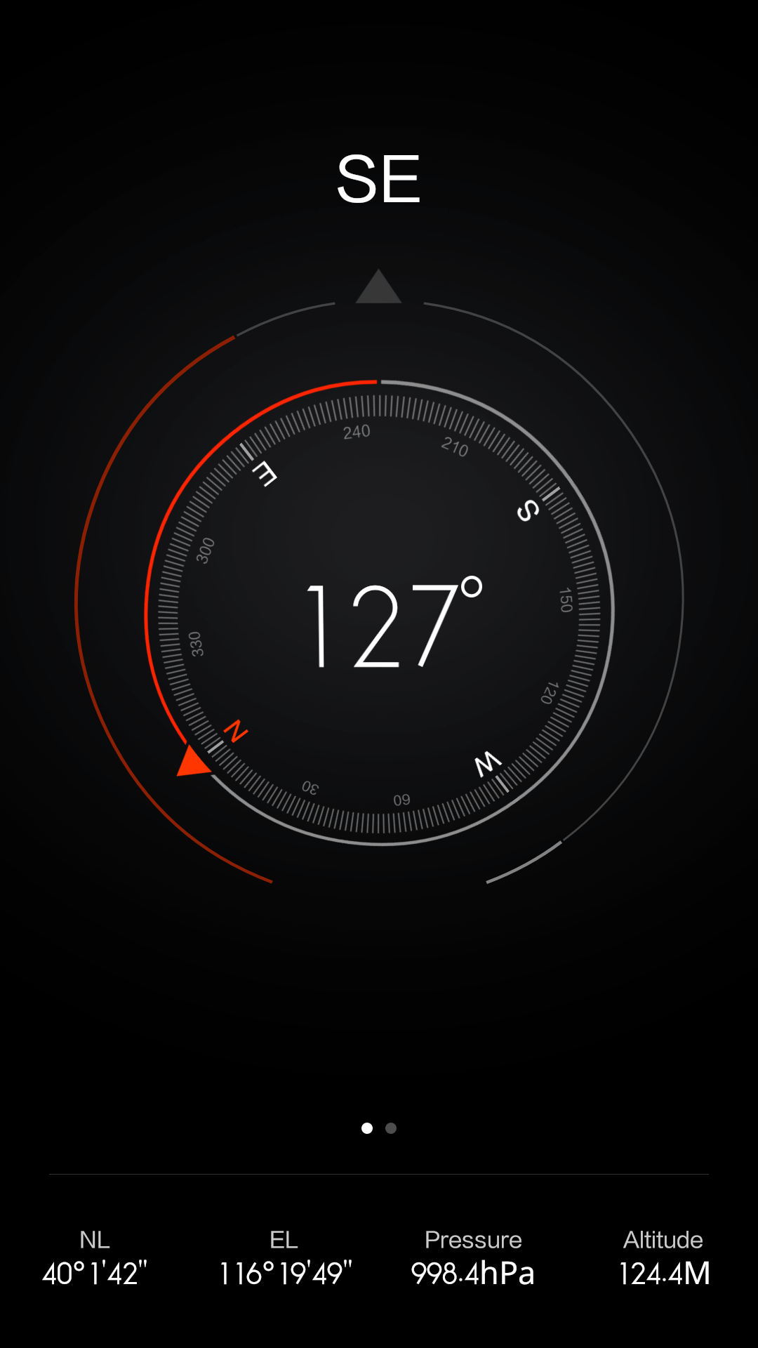
As a person who lives in China, I’ve noticed a lot of Chinese OEMs lack of real identity. Either in hardware,software or both. In the days when Apple was the holy grail of design this could be comprehensive enough. Nowadays so many companies take design seriously even better than Apple. HTC, LG, Sony, Motorola and even Samsung with the new Note 4 are taking design seriously. Don’t get me wrong many Chinese companies have well designed products like OPPO, Gionee or Vivo. But where some of these companies fall short is in software design. There is the “Apple-ish” design going on now with many companies in China. A serious lack of identity in search of a big name and brand recognition. Huge violators and guilty companies of the “Apple-ish” design are Xiaomi and Meizu. Note that we are not talking about features here but overall design. These companies are leading a new move that counter every Android design guide line or principles. No app drawers, rounded corners on all icons, glass and blur software effects, horrendous multitasking UI,much more and if you read these features you’ll find out you’ve seen them somewhere before. Apple redesigned their UI with iOS 7 and even though many had mixed thoughts , they placed a stamp on their new identity going forward. Their new design principles and guidelines. Their new features of course we know where those came from but Apple did come up with a fresh new look. At the time most Chinese OEMs including Xiaomi and Meizu had Android skins looking more like iOS 4 or iOS 5. After iOS 7 they all updated the looks of their interfaces to fit the new IOS software look. This bugs me a lot. Coming from an iPhone I would loved to have seen something different. That’s why we have Android. Instead most of these companies replicate what they see from Apple and totally lack identities of their own which I can identify with. See the gallery below.
Google’s material design is the opposite and seeing what other OEMs like Samsung, HTC, Motorola or LG are doing we can only hope for a different more identifiable user interface and not some Apple IOS clone. Xiaomi and Meizu all run Android but you wouldn’t know as their skins don’t encourage you to use material design. They look more like iOS and follow most of its design perspective. With Lollipop, Google has gone even further away and is standing out in such a way that it’s either follow or get caught. Right now it’s not looking pretty for these OEMs whose UI design looks stale and dated. Now it’s either they follow Google’s design guidelines or get exposed for copying which is what most people see.
In conclusion material design is Google’s word and contract. Building for Android and going forward will depend on it for one’s identification. In 2015 we’ll see more if these companies stick to their IOS design copying guns or move to material design with their iterations of Lollipop.
Stay tuned.


